K-Maxoids Clustering#
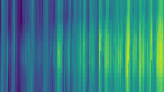
Example comparing k-means and k-maxoids clustering methods.
K-maxoids automatically preserves extreme periods by selecting points closest to the convex hull.
Author: Maximilian Hoffmann
Import pandas and the relevant time series aggregation class
[1]:
%load_ext autoreload
%autoreload 2
from pathlib import Path
import pandas as pd
import plotly.express as px
import plotly.io as pio
import tsam
from tsam import ClusterConfig
pio.renderers.default = "notebook"
# Ensure results directory exists
RESULTS_DIR = Path("results")
RESULTS_DIR.mkdir(exist_ok=True)
Input data#
Read in time series from testdata.csv with pandas
[2]:
raw = pd.read_csv("testdata.csv", index_col=0)
Show a slice of the dataset
[3]:
raw.head()
[3]:
| GHI | T | Wind | Load | |
|---|---|---|---|---|
| 2009-12-31 23:30:00 | 0 | -2.1 | 7.1 | 375.478394 |
| 2010-01-01 00:30:00 | 0 | -2.8 | 8.6 | 364.541326 |
| 2010-01-01 01:30:00 | 0 | -3.3 | 9.7 | 357.416844 |
| 2010-01-01 02:30:00 | 0 | -3.2 | 9.8 | 350.191306 |
| 2010-01-01 03:30:00 | 0 | -3.2 | 9.4 | 345.161449 |
Show the shape of the raw input data: 4 types of timeseries (GHI, Temperature, Wind and Load) for every hour in a year
[4]:
raw.shape
[4]:
(8760, 4)
Create a plot function for the temperature for a visual comparison of the time series
[5]:
# Use tsam.unstack_to_periods() with plotly for heatmap visualization
# px.imshow(unstacked["column"].values.T) creates interactive heatmaps
Plot an example series - in this case the temperature
[6]:
# Original temperature heatmap
unstacked = tsam.unstack_to_periods(raw, period_duration=24)
px.imshow(
unstacked["T"].values.T,
labels={"x": "Day", "y": "Hour", "color": "Temperature"},
title="Original Temperature",
aspect="auto",
)
Simple k-mean aggregation#
Initialize an aggregation class object with k-means as method for eight typical days, without any integration of extreme periods. Alternative methods are ‘averaging’, ‘hierarchical’, ‘kmedoids’ and ‘kmaxoids’.
[7]:
result = tsam.aggregate(
raw,
n_clusters=8,
period_duration=24,
cluster=ClusterConfig(method="kmeans"),
)
Create the typical periods
[8]:
cluster_representatives = result.cluster_representatives
Show shape of typical periods: 4 types of timeseries for 8*24 hours
[9]:
cluster_representatives.shape
[9]:
(192, 4)
Save typical periods to .csv file
[10]:
cluster_representatives.to_csv(RESULTS_DIR / "testperiods_kmeans.csv")
Repredict the original time series based on the typical periods
[11]:
reconstructed = result.reconstructed
Plot the repredicted data
[12]:
# K-means predicted temperature heatmap
unstacked_kmeans = tsam.unstack_to_periods(reconstructed, period_duration=24)
px.imshow(
unstacked_kmeans["T"].values.T,
labels={"x": "Day", "y": "Hour", "color": "Temperature"},
title="K-means Predicted Temperature",
aspect="auto",
)
As seen, they days with the minimal temperature are excluded. In case that they are required they can be added to the aggregation as follow.
k-maxoids aggregation including extreme periods#
Initialize a time series aggregation based on k-maxoids, which automatically searches for points closest to the convex hull.
[13]:
result_maxoids = tsam.aggregate(
raw,
n_clusters=8,
period_duration=24,
cluster=ClusterConfig(method="kmaxoids"),
preserve_column_means=False,
)
Create the typical periods
[14]:
cluster_representatives_maxoids = result_maxoids.cluster_representatives
The aggregation can also be evaluated by indicators
[15]:
result_maxoids.accuracy
[15]:
AccuracyMetrics(
rmse=0.1742 (mean),
mae=0.1266 (mean),
rmse_duration=0.1000 (mean)
)
Repredict the original time series based on the typical periods
[16]:
reconstructed_maxoids = result_maxoids.reconstructed
Plot repredicted data
[17]:
# K-maxoids predicted temperature heatmap
unstacked_maxoids = tsam.unstack_to_periods(reconstructed_maxoids, period_duration=24)
px.imshow(
unstacked_maxoids["T"].values.T,
labels={"x": "Day", "y": "Hour", "color": "Temperature"},
title="K-maxoids Predicted Temperature",
aspect="auto",
)
Here bigger biggest values and lower lowest values can be observed compared to k-means clustering.
Comparison of the aggregations#
It was shown for the temperature, but both times all four time series have been aggregated. Therefore, we compare here also the duration curves of the electrical load for the original time series, the aggregation with k-mean, and the k-maxoids aggregation.
[18]:
# Duration curve comparison using plotly express
comparison_data = {
"Original": raw,
"8 typ days (Centroids)": reconstructed,
"8 typ days (Maxoids)": reconstructed_maxoids,
}
frames = []
for name, df in comparison_data.items():
sorted_vals = df["Load"].sort_values(ascending=False).reset_index(drop=True)
frames.append(
pd.DataFrame(
{"Hour": range(len(sorted_vals)), "Load": sorted_vals, "Method": name}
)
)
long_df = pd.concat(frames, ignore_index=True)
px.line(
long_df,
x="Hour",
y="Load",
color="Method",
title="Duration Curve Comparison - Load",
)
Or as unsorted time series for an example week
[19]:
# Time slice comparison using plotly express
frames = []
for name, df in comparison_data.items():
sliced = df.loc["20100210":"20100218", ["Load"]].copy()
sliced["Method"] = name
frames.append(sliced)
long_df = pd.concat(frames).reset_index(names="Time")
px.line(
long_df,
x="Time",
y="Load",
color="Method",
title="Time Slice Comparison - Load (Feb 10-18)",
)